Date: 12.08.2023

In today's digital era, financial technology (fintech) applications have revolutionized the way we manage our finances. Applications provide users with convenient and efficient solutions for payments, investments, banking, and more.
However, for fintech applications to succeed, they must deliver a seamless onboarding experience that instills trust, security, and simplicity in users. In this article, we will explore the importance of onboarding in fintech applications and discuss strategies for optimizing this crucial process.
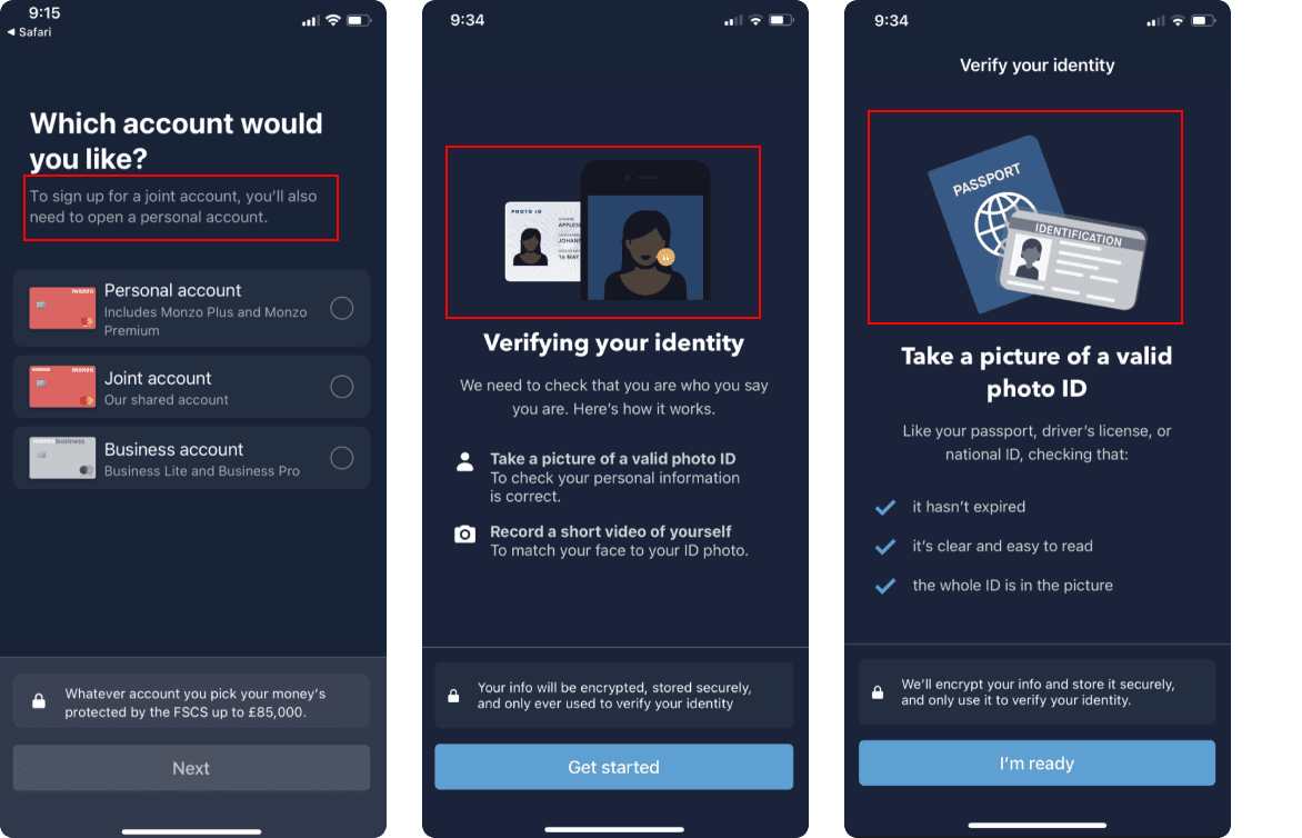
In this case study, I examined four different applications (Revolut, N26, Bunq, Monzo). I took a close look at each one to understand how they work and what contributes to their great onboarding experience.

To evaluate these applications’ onboarding flows, I used two methods: the Onboarding Friction Index and the NNG 10 Heuristic Overview. Combining both methods provided valuable qualitative and quantitative insights, enabling the development of superior onboarding user experiences for current and future apps.

Onboarding in fintech applications sets the tone for users' experience and establishes a foundation of trust, security, and ease of use. It serves as the first impression, shaping users' perceptions of the application's value and functionality. Effective onboarding ensures that users feel confident in using the platform, understand its features, and have a clear path to achieve their financial goals.
Here are 4 applications that i choose from some of the top fintech applications available on the market today: Revolut, N26, Bunq, Monzo.


This metric measures the time it takes for a user to complete the entire onboarding process. It provides insights into the overall efficiency and user-friendliness of the app's onboarding experience.
In the end, the onboarding process for each of the apps took no more than five minutes. Notably, Bunq facilitated the quickest onboarding, with a maximum time of 2 minutes.
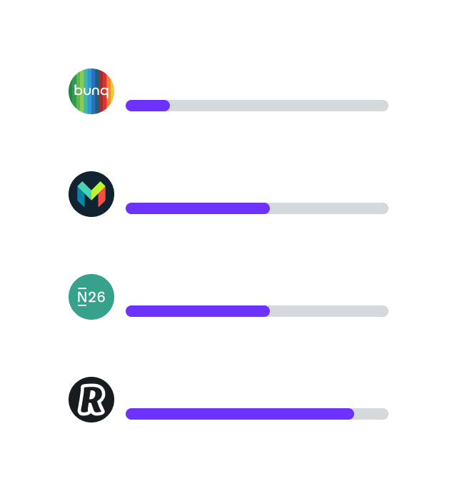
This metric counts the number of screens or steps involved in the onboarding process. A high screen quantity may indicate a complex or lengthy onboarding flow, potentially leading to user frustration or drop-off.
Examining these applications demonstrates the significant variation in the number of screens used during the onboarding process; Banq utilizes 4, while Monzo uses 56. In this case, it is not appropriate to judge the onboarding process solely based on the number of screens. Factors such as the type of information requested, applicable regulations, and specific needs during the onboarding process play crucial roles and must be considered.

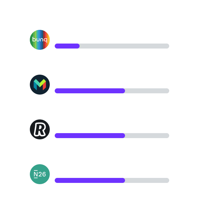
This metric evaluates the number of clicks required by users to complete the onboarding process. Fewer clicks generally indicate a more streamlined and efficient experience.
However, it is important to remember that, along with the number of clicks, another significant consideration is the natural feel of the process for the user, for example, how well the application utilizes gamification.

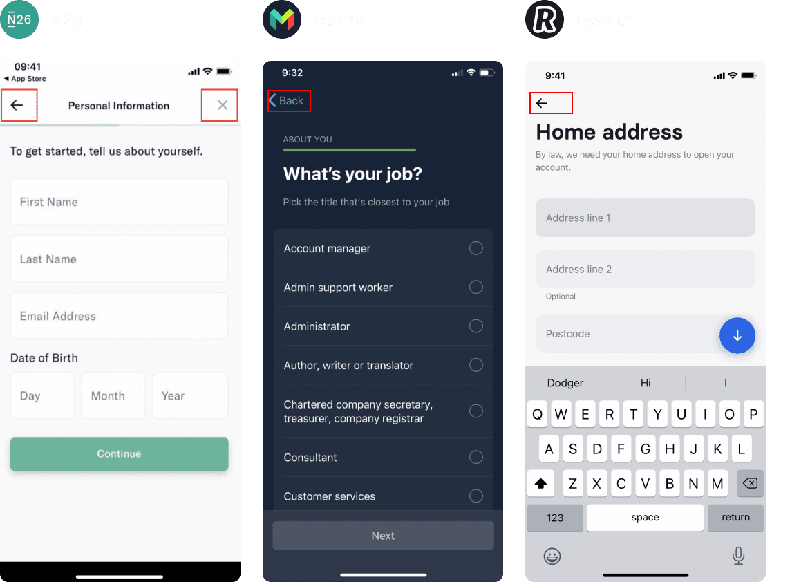
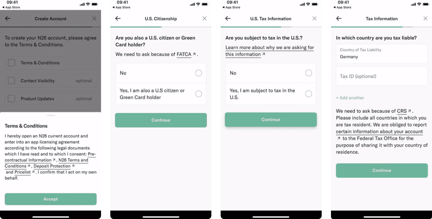
This metric measures the number of input fields that users need to fill out during onboarding. A higher field quantity can make the process more time-consuming and potentially deter users from completing the onboarding.
Clicking is easy to do, but entering text requires much more effort and time resources. In total, the number of text inputs for any application does not exceed 20.

This metric assesses how many users abandon the onboarding process after encountering an OTP verification step. If a significant number of users leave during this stage, it may indicate a poor user experience or technical issues.
Based on our analysis of the discussed applications, we identified two moments where users can exit the app without significantly harming the user experience. However, a third OTP prompt should be avoided, as it greatly increases the chances of users not returning.
On the example of the discussed applications, we can see that there are two optimal times when user might leave the application. If the user leaves for the third time, he might not come back.


The Onboarding Friction Index reveals diverse strengths across different banking apps: Revolut leads with the fewest clicks required, Bunq stands out with the shortest application time, fewest screens, and lowest rate of OTP drop-offs, while Monzo demands the least from users in terms of fields to be filled out.
However, a streamlined onboarding process, characterized by fewer screens and shorter completion time, may not always be beneficial as it might restrict users from providing sufficient information, potentially compromising the richness of the post-onboarding experience. Thus, it is essential for apps to strike a balance between efficiency and thoroughness to ensure a seamless yet comprehensive onboarding experience.

1. Visibility of system status
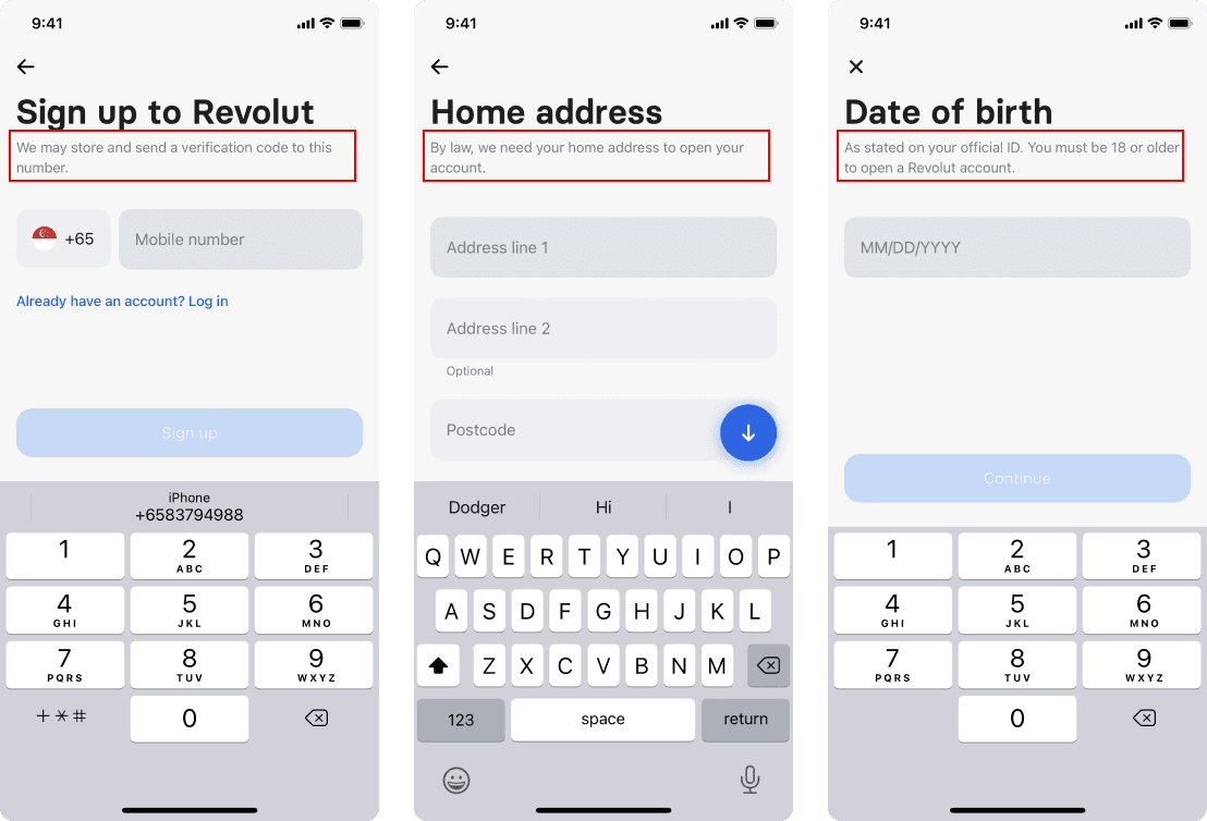
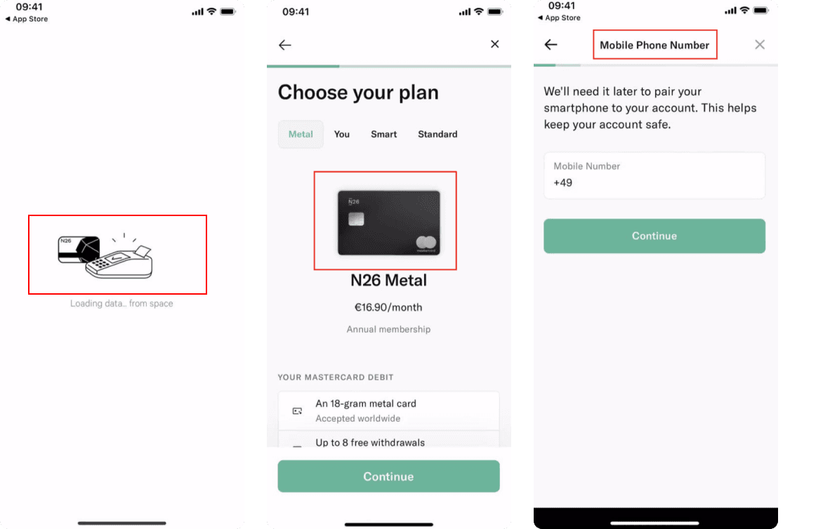
Users should be provided with clear and real-time feedback about what's happening within the app, such as loading indicators or progress bars during the onboarding process.

N26
N26 utilizes a carousel for Explorer steps and two types of progress bars (well-chosen for their respective steps) that give the user a sense of where they are in the onboarding process.


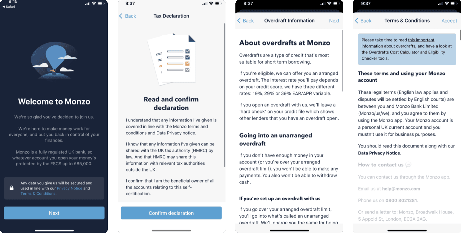
Monzo
Monzo also uses a carousel for explorer steps and incorporates two different types of progress bars. Despite these features, it doesn't explain basic information as efficiently as N26, which additionally offers a few more steps in its onboarding process.


Revolut
Revolut stands out as a clear example of transparency, always informing users why each piece of requested information is necessary.
2. Match between system and the real world
The app's language, terminology, and design elements should be familiar and intuitive to users, aligning with their mental models and expectations.
N26
The visual cues have a match with the real world
Monzo
The visual elements in Monzo are somewhat more complex and potentially overwhelming compared to N26; however, this complexity results in visuals that more accurately mirror real world scenarios.
Revolut
Incorporating them into the app fosters a connection with the real world, enhancing user comfort.
3. User control and freedom
Users should have the ability to easily navigate and recover from errors or unwanted actions during the onboarding process, with options to undo or redo steps if needed.
While Monzo and Revolut are only using back buttons, N26 allows you to cancel the process anytime.
4. Consistency and standards
The app's design, interaction patterns, and terminology should follow established conventions and remain consistent throughout the onboarding process, reducing cognitive load.
N26
Overall, there is no significant violation of the heuristic observed in N26; however, there is room for improvement. The identity and card icons vary slightly in appearance, but the accompanying text aids in preserving a sense of consistency. To further adhere to this principle, it would be beneficial to unify the main artwork/icons for the e-mail concept under a single style.

Monzo
The quality of visual elements is very good here, although busy, they convey a sense of richness and density.

Revolut
Revolut showcases its consistency through the standardization layouts for gathering user information. Each screen features a title, explanatory text detailing the purpose of the information requested, and text fields, maintaining uniformity across the onboarding.

5. Error prevention
The app should prevent errors during onboarding by providingclear constructions and constraints that guide users to input valid information.
N26
In N26, a clear example of error prevention can be observed during the password setting process. The application automatically provides feedback on the password's strength as it is being entered, guiding users away from choosing a weak password and avoiding potential future issues.

Revolut
In many sections of the Revolut onboarding, you will find disable buttons. These allow users to review and correct their selections before confirming their entries, facilitating a more error free experience.

6. Recognition rather than recall
The app should minimize the need for users to remember information from earlier steps by providing relevant and visible cues during the onboarding process.
All these applications have well-titled pages, so it becomes easy for users to collect the information.
Revolut
Revolut predominantly uses a design that features a single text field accompanied by a clear title and descriptive text, facilitating immediate understanding for the user regarding what information to enter.
7. Flexibility and efficiency of use
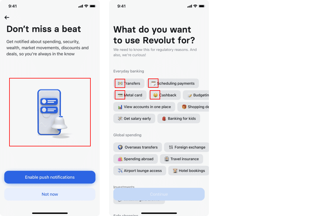
The app should cater to both new and experienced users, allowing for shortcuts and efficient interactions during onboarding without delaying the experience for beginners.
Revolut
Revolut offers personalized content and functionality within the app to cater to individual user preferences and needs. By tailoring the app's features, recommendations, and user interface based on user data or preferences, you can enhance the user experience and provide relevant and targeted information.
Revolut also offers moments of customization, allowing users to tailor the app's settings, layout, or functionality to suit their individual preferences. Providing options for users to make selections, such as choosing themes, organizing content, or adjusting notification settings, empowers them to tailor the app to their liking, fostering a sense of ownership and satisfaction.

8. Aesthetic and minimalist design
The app's visual design should be clean, uncluttered, and focused on the essential information needed during onboarding, avoiding complexity.
All of the applications feature a clean design, avoiding unnecessary elements that could distract users from the information they really need.
Revolut
Additionally, Revolut focuses on one action per screen and prioritizes the content and features to support the user’s primary goals.
9. Help and documentation
The app should offer easily accessible help and documentation, such as FAQs or tutorials, that assist users during the onboarding process and beyond.
N26
In sections where users might find the information confusing, there are links to comprehensive articles that explain the necessity of the required details. However, it was unfortunately unclear how to navigate back from these articles.
Monzo
In the Monzo app, documentation is only available at the beginning and end of the onboarding experience. In contrast, N26 does a better job at offering pertinent documentation when users are likely to need it.
Revolut
Relovut's uses standard on all screens - title, desctirption text about how, for what this information will be used for and text fields.